
Team
Jasper Ling (Me) & 3 Peers
My Roles
Lead UI Designer, UX Researcher
Tools & Skills
Figma, User Research, Prototyping
Timeline
May - August 2023
Who is Big Education?
Big Education (or BigED shortened) is a charity organization that supports education for students worldwide, by offering easy access to donation campaign services on users' mobile devices. Big Education aims to improve the user experience with donation services by providing campaign transparency, donation conveniences, and providing more ways for donors to donate.
Overview
Who is Big Education?
Big Education (or BigED shortened) is a charity organization that supports education for students worldwide, by offering easy access to donation campaign services on users' mobile devices. Big Education aims to improve the user experience with donation services by providing campaign transparency, donation conveniences, and providing more ways for donors to donate.
Problem
Our focus was on the domain of donation and charity, and through our research, we discovered that users found charity services and companies usually don't provide clarity or transparency on where donors' donations go, and how it really impacts the recipients.
Additionally, most charities don't feature a centralized platform that shares their campaign services which made it hard to keep up with the services that donors cared about most. And finally, some charities only accept in-person donations, leaving donors unable to donate at specific hours of the day.
Solution
Design a centralized donation platform to enable users to stay up to date on campaigns, being transparent with where donations go, and an easier and convenient way to donate through pick-ups or subscription services.
Solution Overview
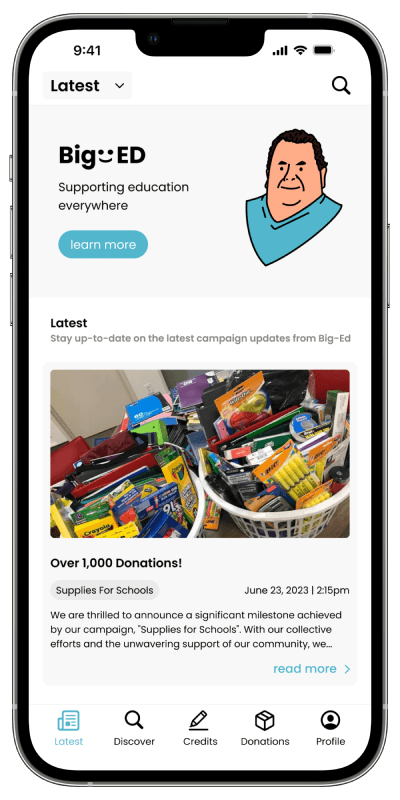
Campaign Discovery
Discover campaigns and support different aspects of education, such as school supplies, equipment, meals and girls' education.

Donation Convenience
Donate in the most convenient way for you, such as booking a pick-up, or drop-off times, doing one-time money donations or monthly subscriptions.
Transparency on Campaign Progress
Know what Big Education and its campaigns are doing by staying up to date on timeline updates, and campaign goal progress.

Discover
Domain Research
To create a platform in the domain of donation and charity organizations, we conducted a domain research to get an understanding of our audience, including donors, organizations and recipients and their roles in this domain. Furthermore, we conducted user goals in this domain, such as what donors, organizations and recipients aim to achieve and do through these platforms.

Research Findings
To summarize our research findings, we noticed that a lot of donors…
1. Feel that their donations are too small to make a difference.
2. Feel a lack of transparency from charities in seeing the impacts of their contributions.
3. Donors want to able to donate at their own convenience and with more options.
Initial Opportunities
To address our research findings, we defined some opportunities and goals to work towards. These are the 4 opportunities presented to us.
1. How might we efficiently determine the correct donations for the appropriate recipient?
2. How might we make the donation process for potential donors more convenient?
3. How might we encourage more people to be involved with donating?
4. How might we make donors' donations feel more impactful?
Initial Ideation
After our domain research, we came up with 3 separate initial ideas that we believed we could further explore and develop platforms to address these opportunities.


Define
Refining our Initial Ideas and Pivoting to Education
After a much need feedback session and in-depth discussion within our group, we refined our 3 initial ideas, pivoted and merged them within the context of education.
So, why did we pivot? We realized our 3 initial ideas were merely functions within a larger scope. For example, an app can implement a function of direct pick-up, or present messaging services for pen-pal systems, or even add a map feature to find countries experiencing emergency relief.
So, why did we choose Education? Because we are students studying UI/UX design in Simon Fraser University. We felt it to be very fitting if we took our initial ideas and research of the donation, and built it around the domain of education, since as a team, we believe that education should be accessible for everyone around the world.
Our "How Might We" Statement
This led to our team coming up with this how might we statement, and the focus of our design direction.
"How might we make the user donation experience for potential donors more convenient and increase the transparency of what a campaign is attempting to achieve and use with donations?"
User Persona
To understand how our users were going to use the app Big Education, we created 2 user personas to help us solidify our understanding of the target audiences and their needs.

Develop
User Experience Maps and Wireflows
After we created our 2 user personas, we created 2 accompanying experience maps to ideate how a user would navigate through the app, starting with browsing for a campaign, and completing their donation, whilst achieving their goals in the process.
I also created accompanying wireflows for the 2 experience maps to visually showcase how these users would navigate through the app to achieve their end goal.

Wireframes
As the UI/UX Design Lead of my group, I led the design direction for our design solution. As a group, we determined the different features needed to fulfill our users’ needs and goals.

Deliver
Usability Testing Research Methodologies
Before moving towards our final wireframes, our group conducted usability testing interviews with 7 peers, and 2 of which were experienced donors. Testing was done through observation with hands-on the prototype, using ask why’s, and think-aloud methods. We noted down all the feedback we received, and categorized them based on experience and usability issues.


Usability Testing Results
After our usability testing interview sessions, we reflected users’ feedback onto our final designs. Here are some of the major and notable changes that were made.


Final Design
Here are the final screens for Big Education.


Outcomes
Takeaways
I am incredibly proud of the final designs we came up with. We worked incredibly hard to solve user problems and come up with ideas and features that mattered most to our target audience. The challenges we faced were incredibly important to my learning as a UI/UX designer. For example, we initially wanted our app to focus on improving the donor, charity organization and the recipient’s user experience. However, realize that not all recipients would have access to digital devices, and that designing an experience for everyone in the donation process would’ve been out of our scope. Additionally, we knew that the logistics of charity organization operations and legal definitions were out of our scope. This is why our app focuses mainly on the interactions between the donor and the services of the charity organization, but understanding what each user group needed was what made our project come together.
This academic project case study, last updated in 2023, was not designed for mobile and is best viewed on a desktop.