Team
Jasper Ling (Me) & 2 Peers
My Roles
Lead UX Researcher, UI Designer,
Tools & Skills
Figma, User Research, Prototyping
Timeline
May - August 2023
Overview
Who is Duolingo?
Duolingo is a popular educational platform that helps users learn new languages and improve upon previously learned languages. Their structured curriculum offers lessons and exercises that involving reading, writing, speaking and listening exercises with a gamification approach to incentivize consistency and continued usage.
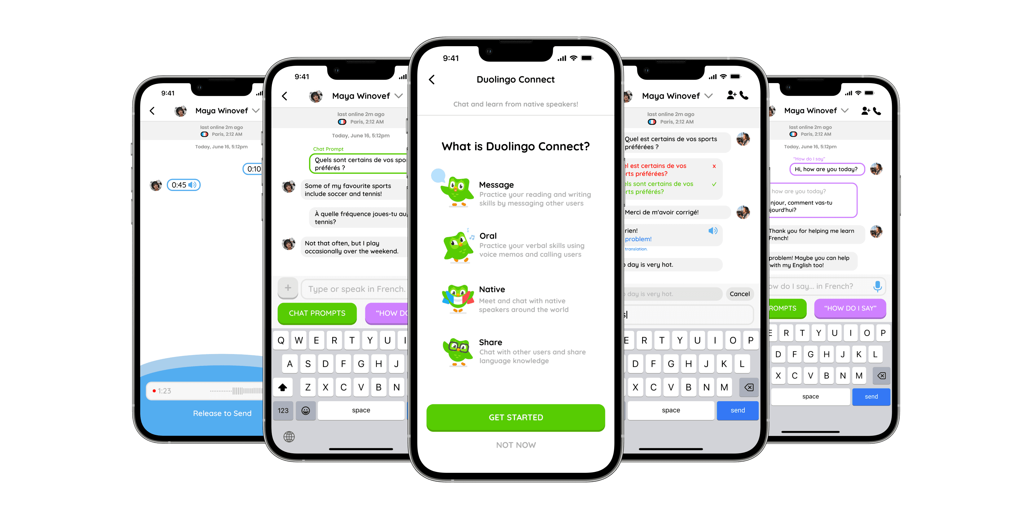
With Duolingo Connect, we designed and delivered a brand new experience that supports deeper language learning users by connecting users with native speakers to improve their language proficiency.
Problem
Our research strongly indicated that Duolingo is not a platform suited for deeper forms of language learning, and provide little to no way of helping users apply their skills in real world settings.
Solution
Design a new feature for Duolingo that enables users to connect with other native speakers and apply their language knowledge to encourage conversations that involve a deeper use of language skills.
Solution Overview
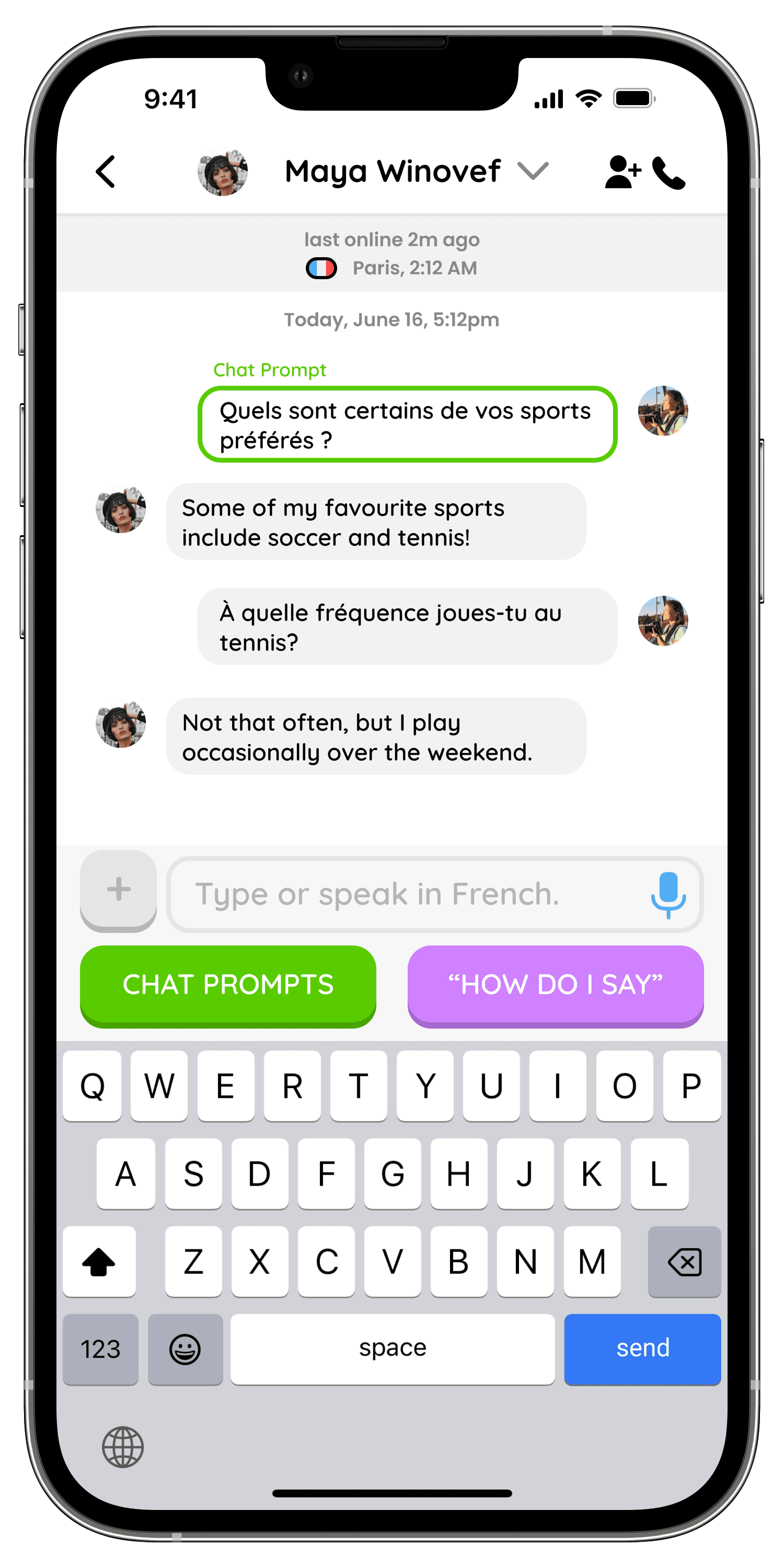
Conversation Starters
Easily kick-off your conversation with other users by using randomized chat prompts or by sending an image.

Conversational Tools
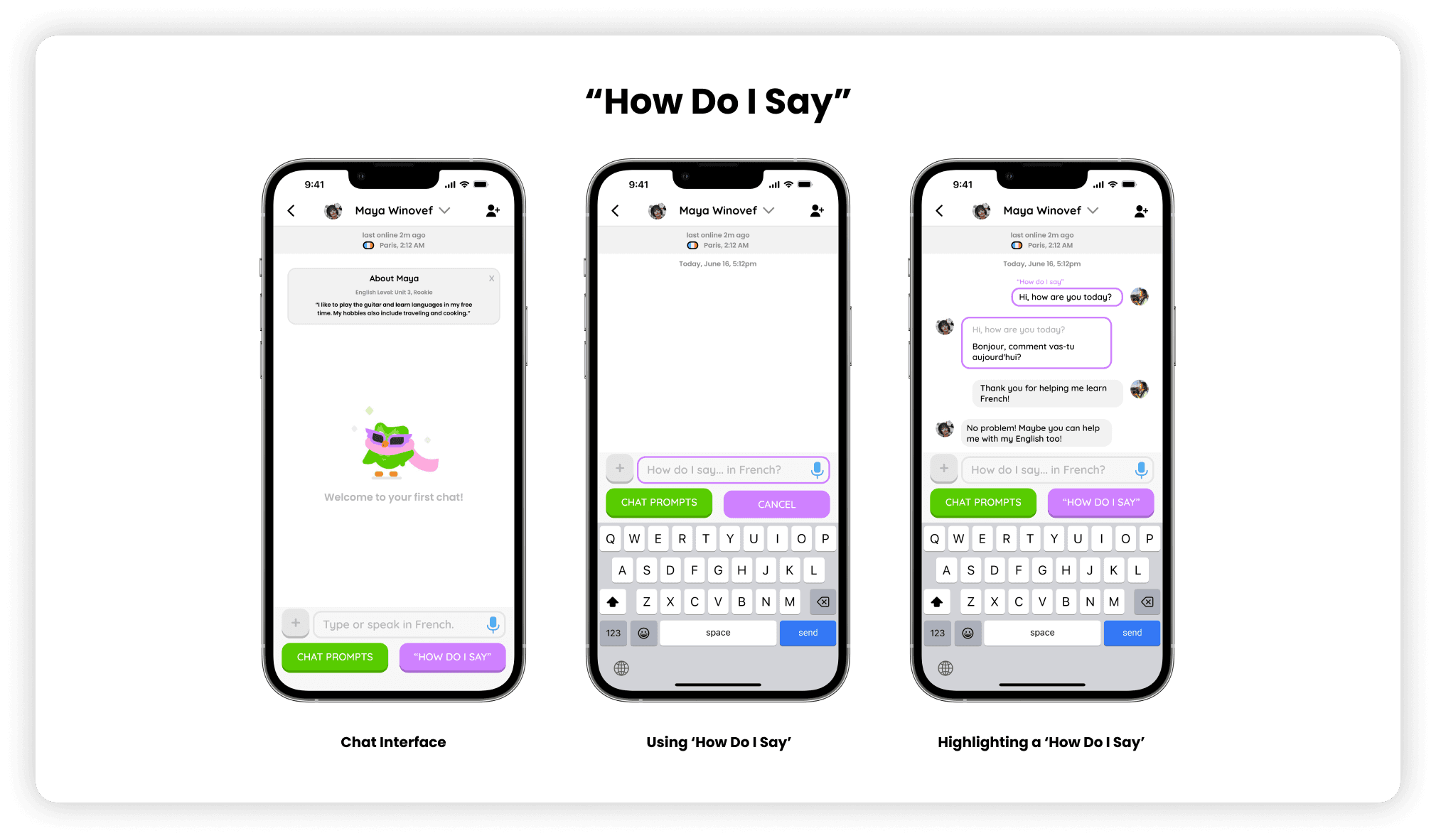
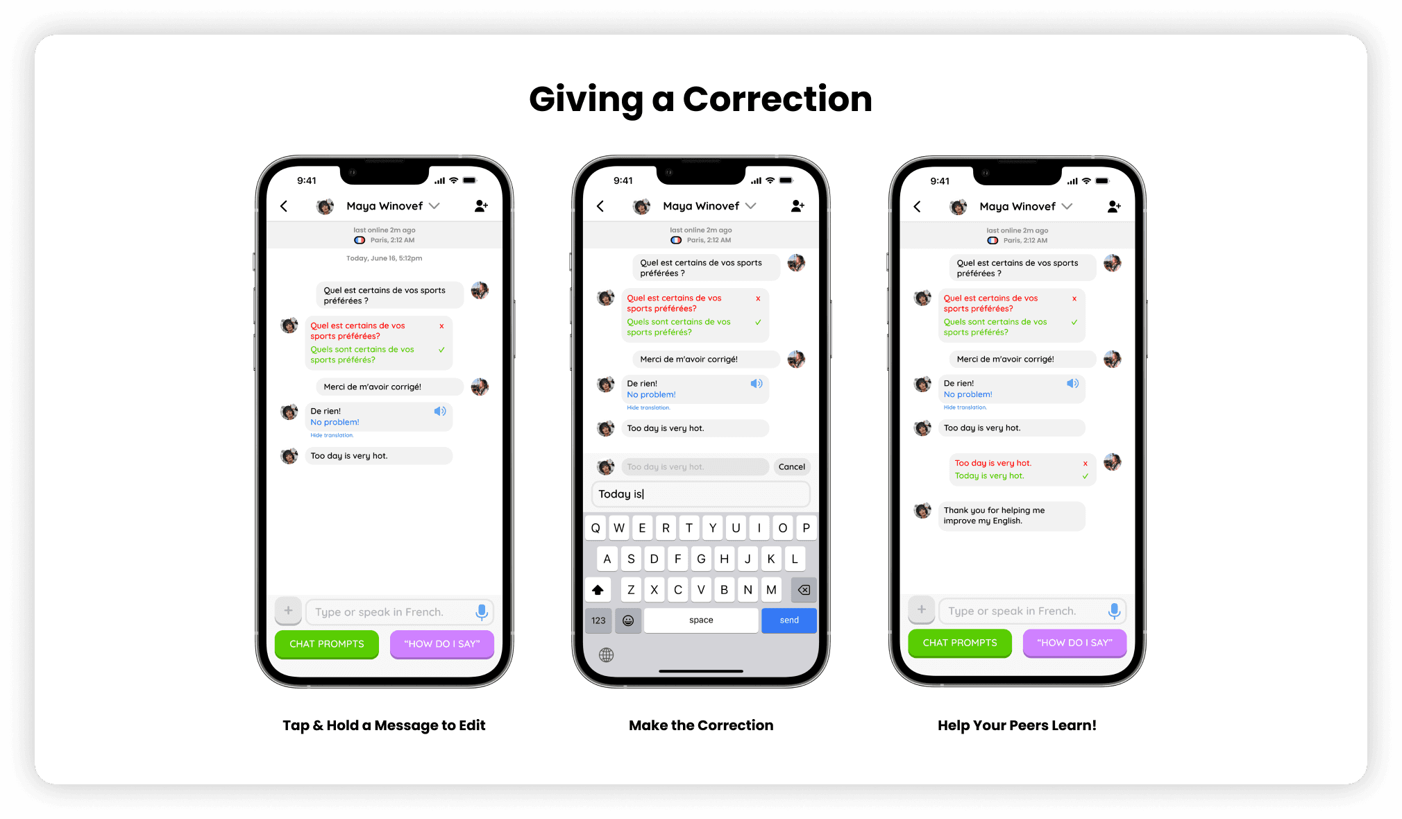
Don’t know how to correctly say a phrase? Receive grammatical corrections, translate text, or turn text into speech during your conversation.
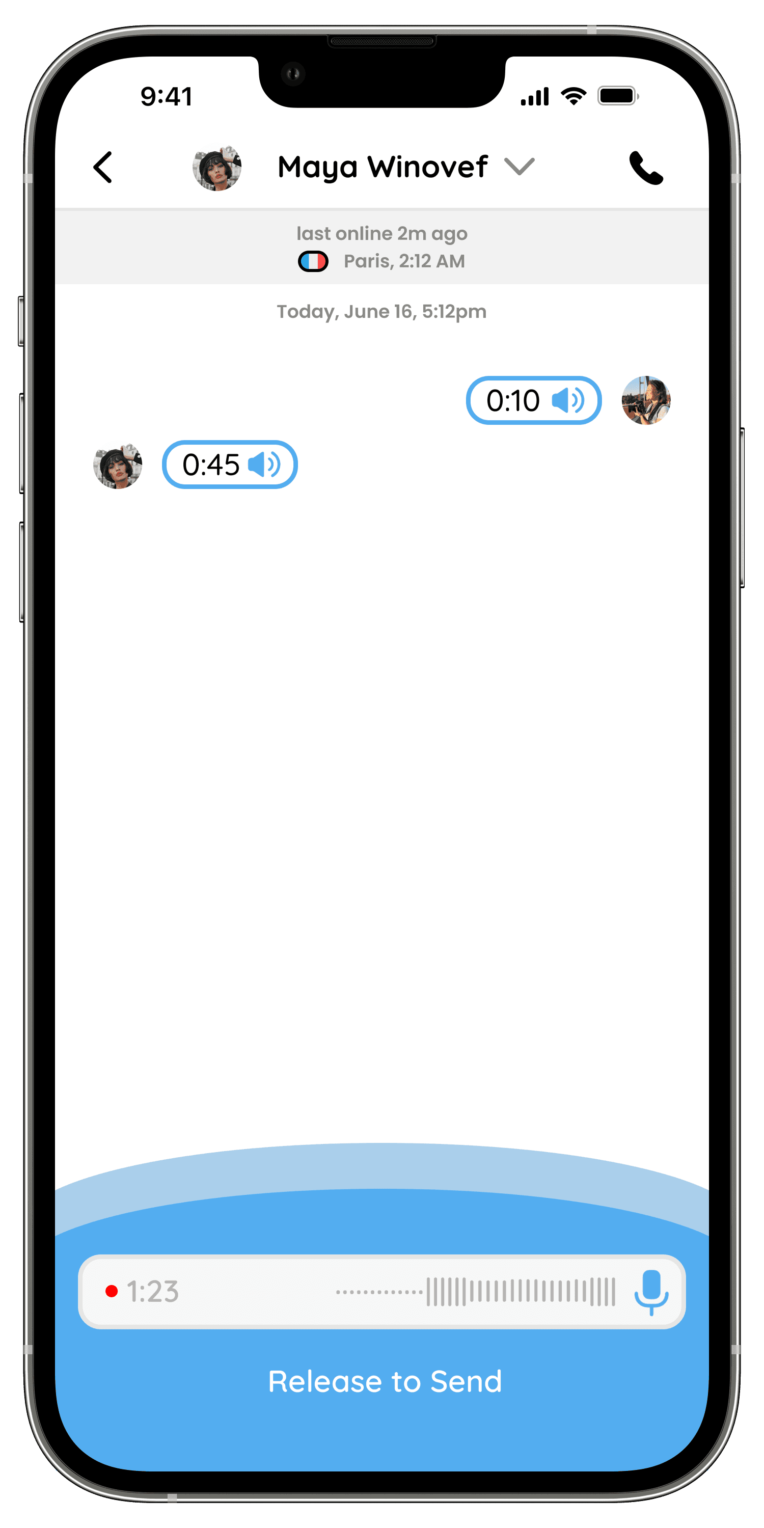
Speak a-loud
Converse and practice your pronunciation in-line with voice memos and receive feedback.
Discover
Double Diamond Design Thinking Process
We chose the Double Diamond Design Thinking Process for its effectiveness in fostering ideation, iterative design, and user-centric thinking in our project.
Audience Research
To understand who Duolingo’s intended user audience is, we conducted an audience research into the platform. After consulting numerous sources, as well as the company’s website itself, we concluded that the:
Primary User is a "Casual Learner"
- someone who uses Duolingo as an educational platform to casually learn languages for basic communication vocabularies or for trying something new.
Potential User is an "Eager Learner"
- someone who is eager to learn a new language at a more proficient or higher level basis.
Qualitative User Research
After our initial audience research, we wanted to dive in deeper, and get an understanding of what users of Duolingo felt about its user interface, user experience and whether or not Duolingo has positively impacted them in their learning efforts.
We empathized with our users through qualitative user research activities involving an observation period, and ask-whys. A general consensus included:
User Interface Feedback:
- Friendly UI Design, Intuitive Gamification Experience for Learning Activities, and an Easy UI Navigation Interface.
User Experience Feedback:
- Not Suitable for Deep Learning, Lack of a Sense of Community, No Applications in Real Life.

Why Our Users Quit Duolingo
After our user interviews & research, our interviewees all stated that they quit Duolingo. We found this to be incredibly important to our research in how we’d approach introducing a new feature… Here’s what they said:
1. Users desired some form of person-to-person interaction and connection with other Duolingo learners
2. They wanted more academic resources to help them learn more
3. They felt a lack of real world use / applications from the lessons learned
4. They did not feel confident in initiating or holding conversations in real life
Define
User Personas
To understand the direction of the new feature we are going to plan to introduce to Duolingo, we created 2 user personas to help empathize with our users and address their needs and to identify opportunities for design solutions.


Our "How Might We" Statement
Following identified pain points, we came up with a how might we statement, and the focus of our design direction.
“How might we design a new experience that encourages users to apply their knowledge by engaging with other Duolingo users and accessing more resources to help improve their proficiency and conversational responsiveness?”
Affinity Map
After our brainstorming session, I created an Affinity Map of our ideas to help better organize our thoughts, and as a group, we evaluated the effectiveness of how our ideas addressed our pain points.

3 New Feature Candidates
As a group, we decided upon 3 new feature candidates to pitch towards our teaching team.
1. Duolingo Chat
Engage in live conversations with players learning the opposite language that you are and receive instant corrections & feedback.
2. Duolingo Versus
Compete live with other same-level-players to answer realistic language comprehension exercises and win by elimination.
3. Duolingo Library
Learn deeper through reading popular literature, media, listening to audio-books and responding to comprehension questions.

Our New Feature: Duolingo Connect (Formerly Duolingo Chat)
After numerous feedback sessions with the teaching team and in-depth discussions within our group, we decided to move forward with Duolingo Chat.
This was because we felt that Duolingo Versus would’ve been way out of our scope, and focused more on designing a video game rather than addressing user needs, and Duolingo Library would’ve been a very ambitious catalogue of academic resources spanning many languages that we wouldn’t have access to.
After moving forward with Duolingo Chat, we expanded upon the idea of user to user connection, and renamed it Duolingo Connect.
Develop
Low to Medium Fidelity Wireframes
Get a glimpse into the beginning of our planning and ideation stages for the Duolingo Connect feature.

Style Guide
Here is the style guide I designed to help my team with designing a consistent and cohesive design language across the app. It also incorporates familiar colours from the original Duolingo app to make the feature feel as though it was built right in.


High Fidelity Wireframes
These are the high fidelity wireframes developed after numerous iterations.
View Prototype

Validating through Usability Testing
Using the same group that we began our user research with, we conducted thorough usability testings.
1. Users noted that being dropped into a conversation without knowing who they are is daunting. We addressed this by incorporating a brief user biography to warm up the conversation.
2. Users found the black text confusing to read, in regards to which text is correct or being corrected. We addressed this by incorporating colours.


Addressing Ethical Concerns
During our usability testing, a notable issue was in regards to ethical and privacy issues with the voice call feature, which we ended up scrapping as a team. Here were our reasons.
1. Calls are ambiguous, and can lead to discussions that are unguided or unintended by our feature design.
2. Practicing oral speech skills is already addressed through voice memos.

Deliver
Final Design
Here are the final screens for Duolingo Connect.






Outcomes
Reflection
This project has taught me a lot as a designer.
1. Limiting Voice Options
Due to findings in our usability testing, we opted to remove the voice call ability to prevent malicious or ambiguous conversations with users. The original intent behind this feature was to enable users who wanted full control of their conversations by conversing in real time. However, we felt that this also didn't match the purpose of Duolingo, which was to learn little by little each and every day.
2. Widening User Research
All of our users reported to us that they quit Duolingo during our user research. I believe that if we interviewed more users, we may have gotten more insight on why some users stayed instead and what is keeping them on the platform. I believe this would've greatly impacted our design direction elsewhere.
In the Future
If I were to continue this project in the future, one of the main concerns I would address is how to counteract malicious users who miseducate other users on grammar usage or use this medium to promote hate or spam. This wasn't brought up in any of our usability testing, however, it was something that I had noted in the back of my mind throughout this project. I would address this issue by introducing a user verification system and a reputation ranking system, for users to provide feedback on reputable users.
This academic project case study, last updated in 2023, was not designed for mobile and is best viewed on a desktop.