
Website Interface & Experience Redesign
Maximillien Specialty Foods
Team
Jasper Ling (Me) & 3 Peers
My Roles
Lead UI Designer, UX Researcher
Tools & Skills
Figma, User Research, Prototyping, Testing
Timeline
April - May 2023
Overview
Who is Maximllien?
Maximillien Specialty Foods (formerly as Maximillien & Co.) is a local small business that creates custom packaging on bulk products for businesses in the gift basket industry, such as souvenir shops, and hotels. By working with our client, we delivered a redesign of their website to improve their customer's navigational experience and provide an all-new product customization experience.
Problem
Maximillien Specialty Foods' founder, Dene, noted that she encountered numerous frustrations while running her business with her team.
1. Visitors to their website were confused on who can purchase their products (businesses only!), resulting in many emails and phone calls asking why they couldn't purchase their products.
2. Keeping track of customer product customizations is a tedious and frustrating process for Dene, as she often finds herself constantly communicating back and forth with customers, causing her to waste time that could be spent on managing her business.
3. Visitors to their website were confused on what products were actually sold, and couldn't find them.
Solution
Designing a new navigation experience for product discovery, an all new product customization experience, and clarifying the business' target audience on the front page.
Solution Overview
Audience & Business Practices
Highlighting mission and values to build trust and highlighting the appropriate audience that is catered by this business.


Streamlined Categorization
A new product category discovery experience with a sidebar that is consistent on every page and a new breadcrumb navigation system.
All-New Customization
An all-new intuitive product customization feature for their customers, making it an easier way to track customer product preferences.

Uncovering the Problem Space
Client Interview
To understand the direction of our research and design goals, we conducted an hour interview with Dene, the owner of our client Maxmillien Specialty Foods, to discuss her pain points and frustrations she had encountered while running her business for her own clients.
Rose, Bud, & Thorn
We compiled our interview notes and data gathered from Dene into a brief group discussion using the rose, bud, and thorn method to discuss and reflect on what we learned from Dene, and to see what opportunities were presented to us.

Affinity Map
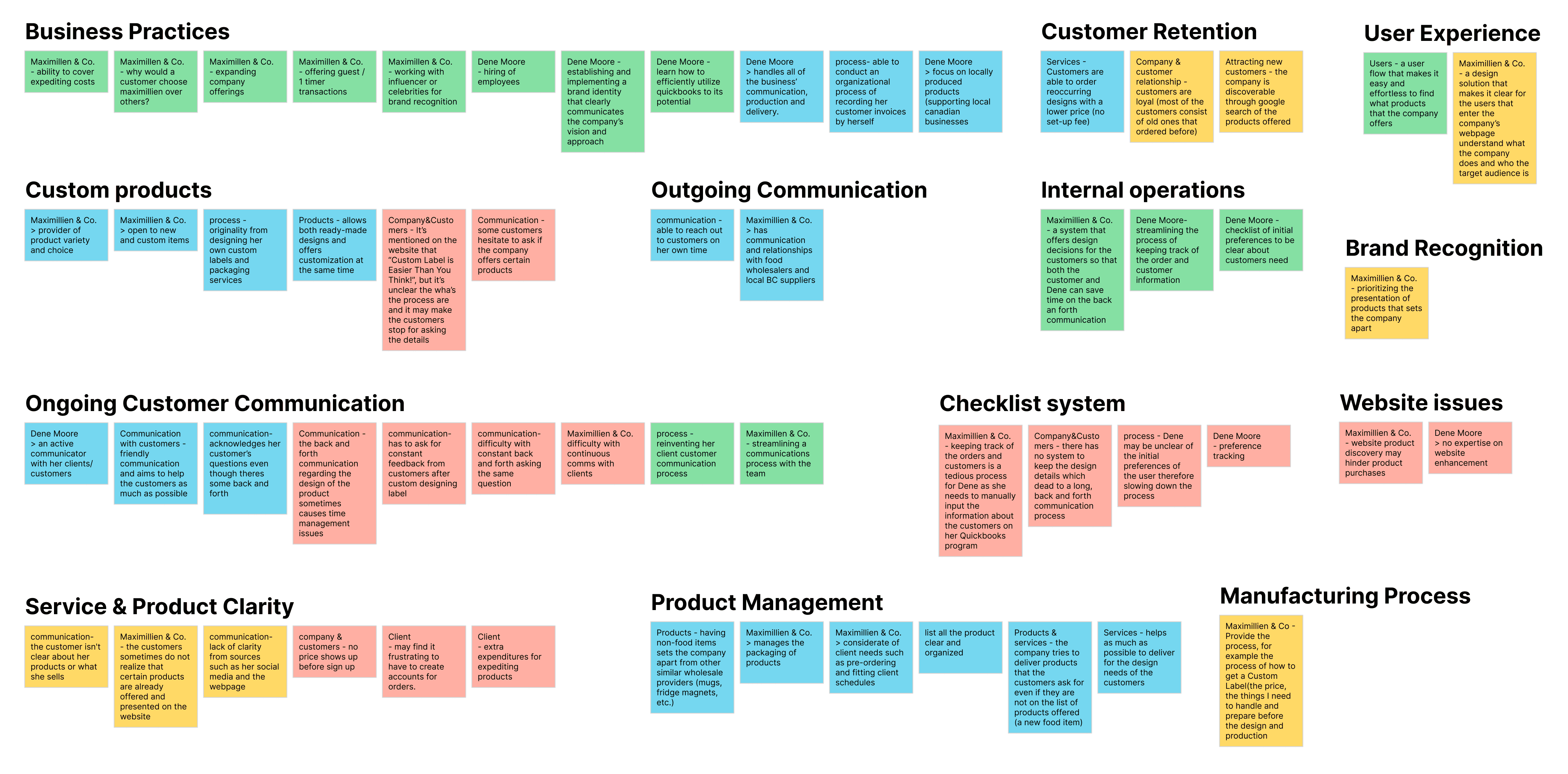
After our group discussion, I grouped our notes into similar categories, in relation to areas of focus. This helped our group to have a collective visual of different areas of the Maximillien business that we could tackle to create a potential design solution. Our notes highlighted in yellow were opportunities that we felt most aligned with Dene's pain points and presented opportunities within our scope.
Narrowing our Design Direction
Difficulty / Importance Matrix
To narrow in on our potential design opportunities, I created a difficulty / importance matrix to chart and visualize the scope of our ideas. This helped us identify which ideas may require more effort and time to create a potential design solution.

Key Insights & Design Direction
Having identified our ideas and scope for creating a design solution, we've identified 3 key insights that are relevant to Dene's frustrations to drive our design direction.
1. Designing a navigation system for product discovery and categorization to make it easier for customers to find the products they need and discover new products.
2. Highlighting their mission and values to build customer trust and brand identity.
3. Creating a new product customization feature to reduce external communications with Dene and track customer preferences digitally.
Our "How Might We" Statement
This lead to our team coming up with this how might we statement, and the focus of our design direction.
"How might we effectively communicate with customers to help them better understand our products while addressing their individual needs and preferences?"
User Persona
I created 2 user personas to help solidify our understanding of the target audience we're designing for.

Developing our Solution
Website UX Analysis
First, we conducted an in-depth analysis of the current UX of the website from the point of view of the Personas, and identified issues to fix relating to the key insights relevant to our client's frustrations.
1. It is difficult to navigate between different product categories without backtracking constantly.
2. Navigating between different product categories requires backtracking and bread crumbs are not accurate.
3. Maximillien's company mission and values are hidden in the footer, and does not demonstrate a strong connection with visitors.
4. Creating a new product customization feature to reduce external communications with Dene and track customer preferences digitally.
5. Navigating between different products customization categories and options requires backtracking
Competitive UX Analysis
Then, we conducted a competitive analysis of other UX implementations on other popular product-selling websites, such as H&M, Uniqlo, and Purdy's Chocolates. We evaluated their UX designs, and came to several conclusions for our own redesign.
1. Implement a product navigation sidebar for easily navigating between product categories.
2. Reduce backtracking with accurate bread crumbs and consistent product navigation sidebars.
3. Implement Maximillien's company mission and values on the landing page.
4. Design a product customization feature that progresses through steps.
User Flow
I created a user flow chart to demonstrate general points of access that is available for customers who visit the website.
For our design direction, we narrowed the scope of the pages (grayed out), and instead focused on addressing the key insights that were relevant to Dene's original pain points in the coloured squares.
We brainstormed ideas on what we could implement within the coloured squares.

Designing our Solution
Wireframes
As the UI/UX Design Lead of my group, I lead the design direction for our design solution. For these wireframes, I collaborated and did a UX market research of other product selling websites with one other peer.

Usability Testing
I conducted usability testing interviews with 5 participants after we created our high fidelity wireframes to receive user experience feedback. I had these participants complete a set of tasks that involved performing tasks related to our 3 key insights. Testing was done by observing their navigation process, and their thinking process which was to be said aloud. These changes were then reflected onto our final design solution.
1. To discover a specific product with the new navigation system for product discovery and categorization.
2. To find and feel more connected with Maximillien & Co.'s mission and values.
3. To easily find out how to customize a product, and complete the customization process.


Final Designs
Here are the final screens for Maximillien Specialty Foods, with their before and after designs.


Outcomes
Takeaways
I am proud of the final design solution that we came up with, and Dene was especially impressed by our solution to solving customer customizations of their products. If I were to continue on this project, I would definitely love to flesh out the other wireframes of pages that we did not pursue as they were out of our scope at the time. This project enabled me to take the lead on the design direction and really practice and apply my UX process skills a lot more.
This academic project case study, last updated in 2023, was not designed for mobile and is best viewed on a desktop.